

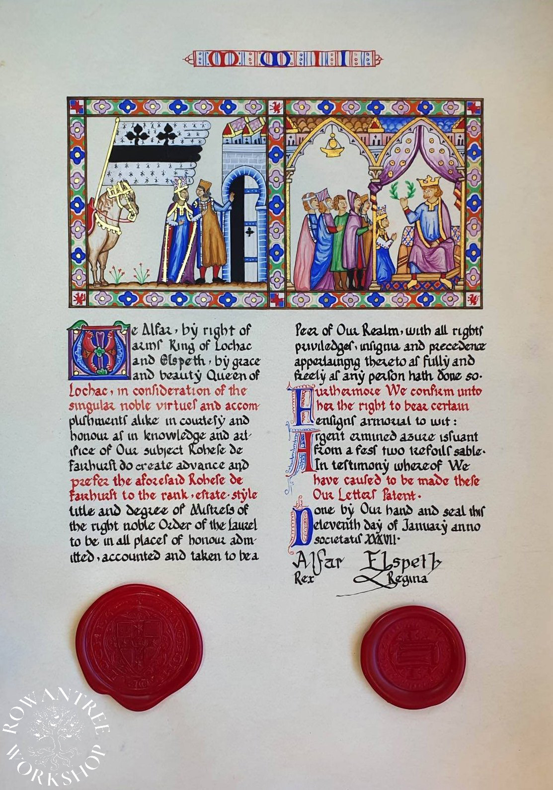
This piece is based on the Cantigas de Sancta Maria, a Spanish musical manuscript from the late 13th century.
I made this piece for my friend Rohese, who loves all things 13th century Spanish – especially the Cantigas manuscripts. This was given in recognition of her research into Spanish costume: the Order of the Laurel within the SCA Kingdom of Lochac.
Research and Design
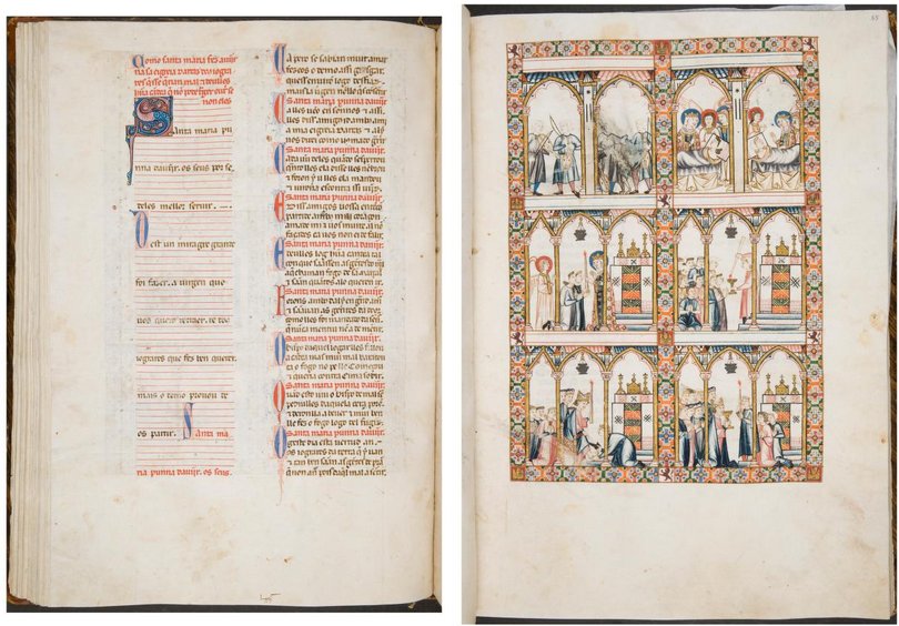
The Cantigas de Santa Maria is a book of songs, written for the Castilian King Alfonso X during his reign (1221–84), In fact, the songs are set out in four books, with differing styles of illumination. I have based this piece on the Florence manuscript BNCF, Banco Rari 20 and El Escorial MS T.j.I (Códice Rico).
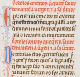
Most of the pages are laid out in pairs, with the music and lyrics in two left-justified on the left hand page. Each song starts with a highly decorated initial, and verses on some songs start with a red or blue initial. The text is written in Gothic Textura Prescisus, with one or two lines rubricated (usually the chorus).
The related right hand pages have a set of 6 illustrations in a grid formation. Each image has a flowered border, with castles (for Castile) and lions (for Lyon) in the corners. I merged these into a single page, with a set of two illustrations above two columns of text.
The Códice Rico has the song number at the top of the page in decorated Roman numerals, which I adapted to show the year of the award.
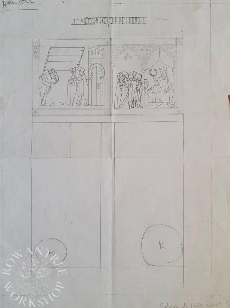
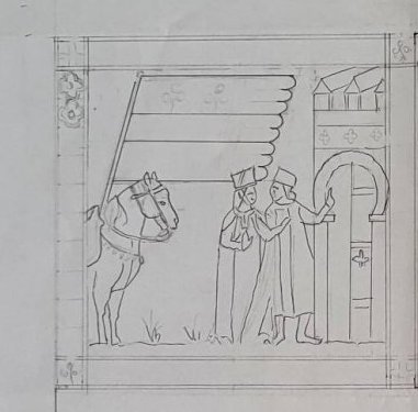
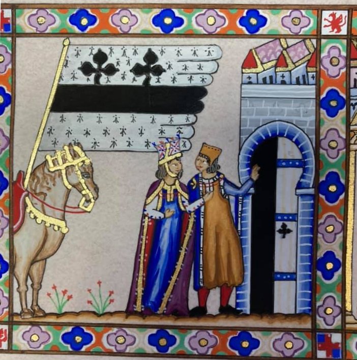
For the left illustration, I combined images of a horse, a couple and a doorway from different images, and added a large banner showing Rohese’s heraldic device.

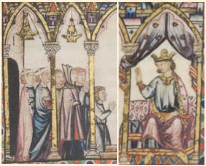
For the right illustration, I combined a group of people and a king, adding a laurel wreath and altering some of the clothing. I copied the flowered border, but replaced the corners with a cross (Kingdom of Lochac) and a red griffin (Barony of Politarchopolis).

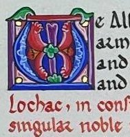
I could not find an illuminated initial W, so I took and M and turned it upside down. I was able to find examples of all the paragraph capitals, so I could simply copy them. I used the rubrication for 2 lines – not as a chorus, but simply to create the overall effect of the Cantigas pages.

Construction
Once I was happy with my layout and illustrations, I did several text samples to see what pen size and spacing I needed to fill the space comfortably. I also tested options for the rubrication – diluted gouache gave a much better than red ink.
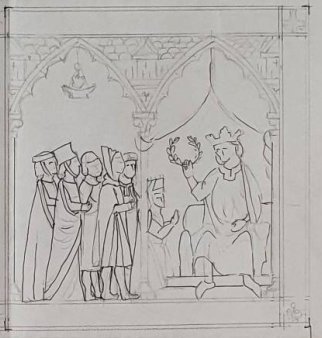
I transferred the outlines of the text area to the parchmentine, and lettered the text using two pens – one for ink, and one for the red gouache. Once dry, I used a lightbox to trace my design in pencil, then inked the lines in fine black. Once dry, I erased all the pencil lines.
First step – the gold. I laid an easy gold size (PVA mixed 1:1 with water, plus some red gouache) and let it dry. I breathed on the size to reactivate it and laid the 22 gold leaf. When dry, remove excess leaf with a brish, then use a penknife to tidy the edges.
The borders were ‘colour-by-numbers’ – filling one colour at a time, but I worked the scenes more like paintings. I enjoyed the unusual palette, with orange and light green and pink as well as the usual red and blue. I painted the paragraph capitals freehand, since pencil would have shown under the gouache.
White highlights and a final inking to finish off, except for hands and faces which are best without.
Rohese was very pleased with the result, and all the details.