

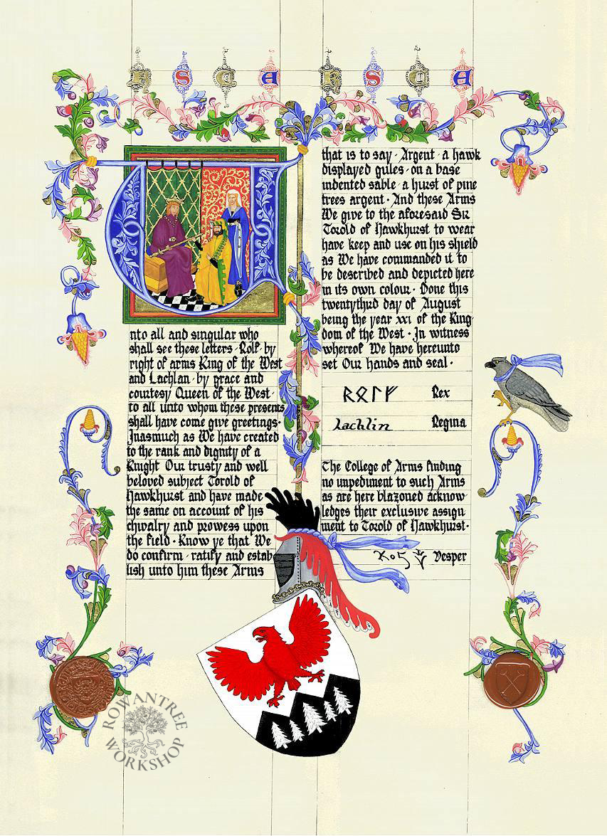
This piece is based on the massive Wenceslas Bible, made in Prague in the 1390s.
I made this piece for my friend Torold (known as Torg), to celebrate his martial prowess as a Knight in the SCA Kingdom of Lochac.
Research and Design
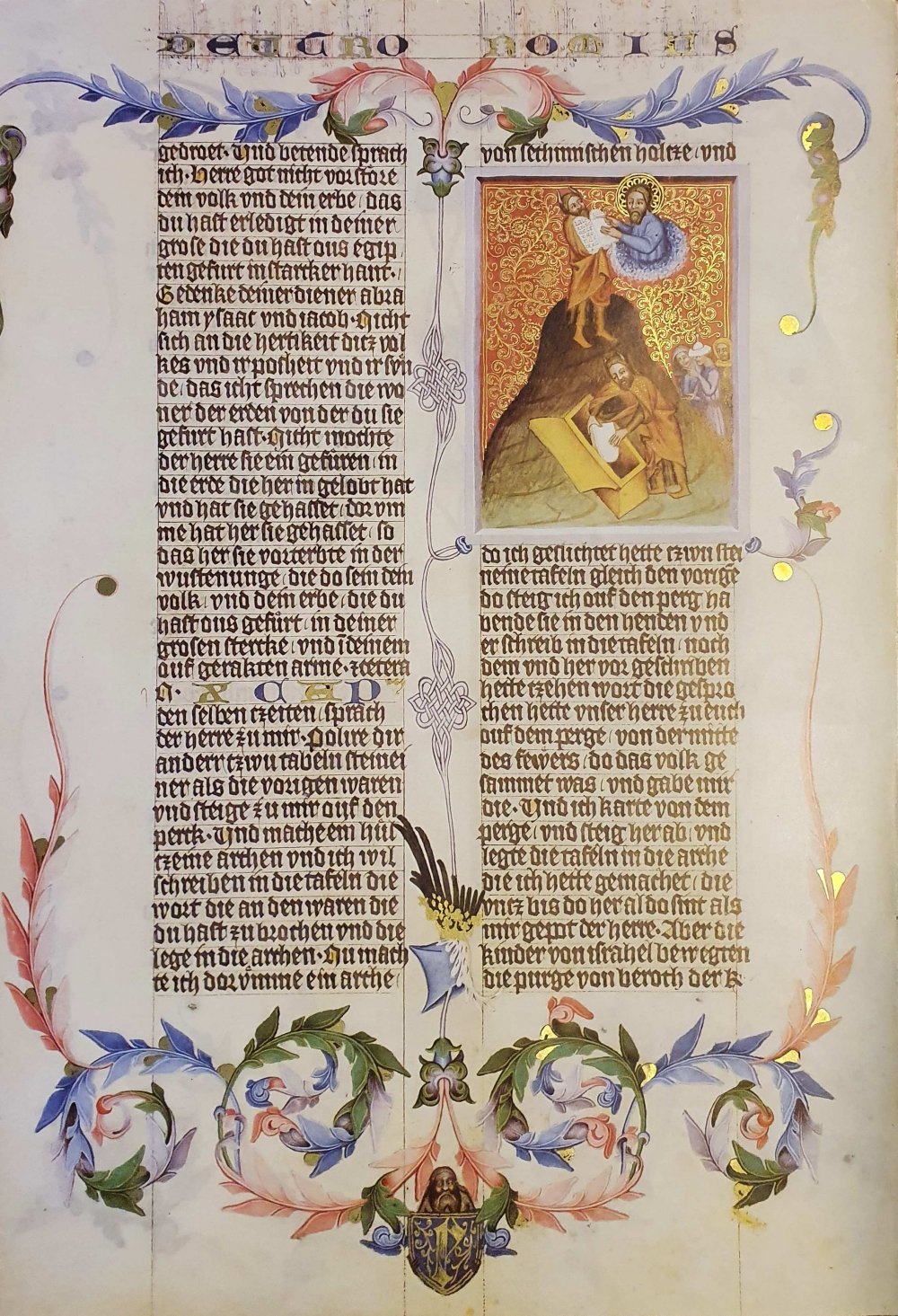
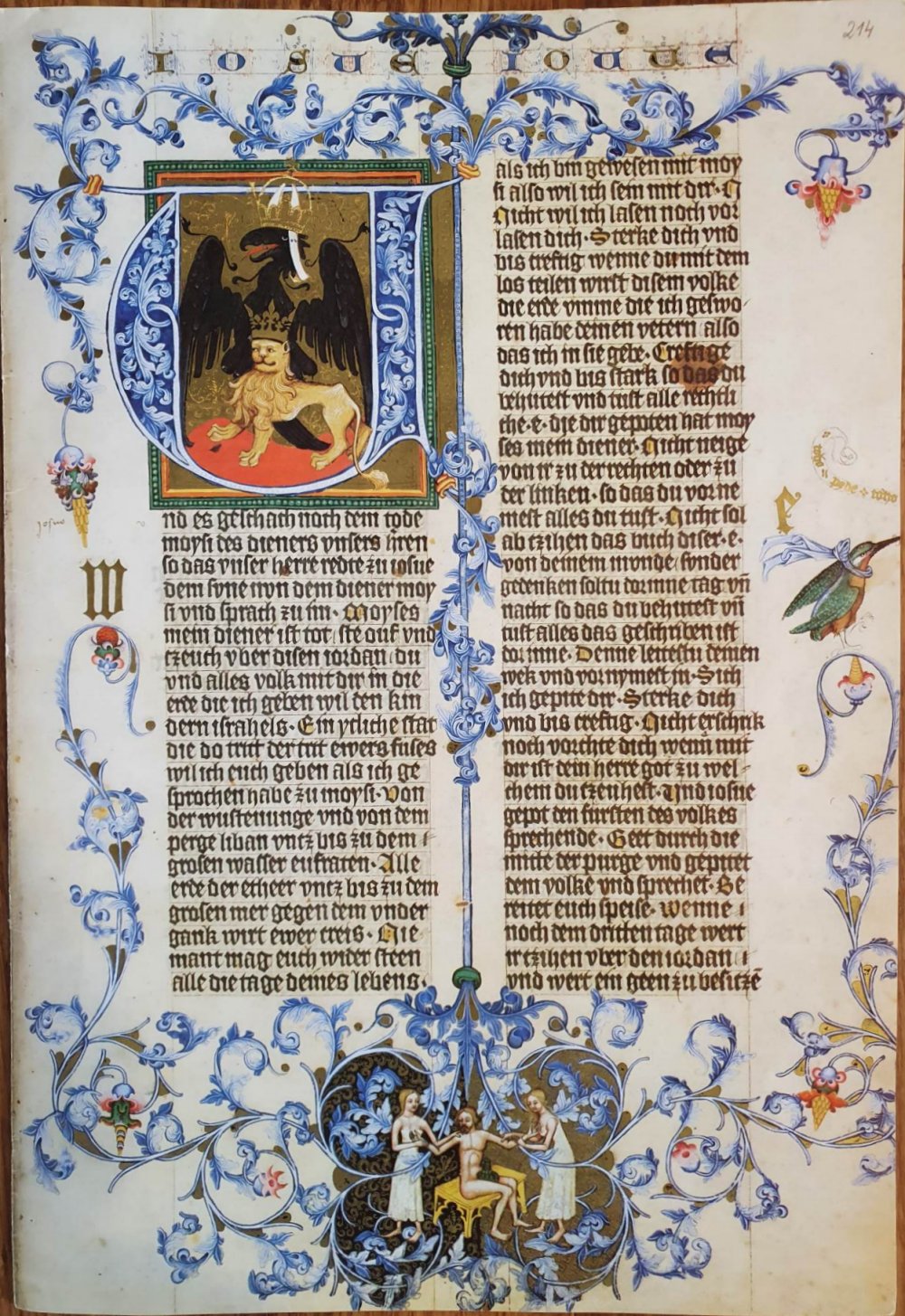
The inspiration for this piece comes from the Wenceslas Bible, which was made in Prague for King Wenceslas IV in 1390 -1400. I was given a full sized sample folio (4 pages) from a high quality facsimile of this work – a wonderful source, but I have not been able to determine the folio references.
This huge scale Bible was set out in a 2-column, left-justified format, written in Gothic Textura Quadrata script. Many of the pages are decorated with ornate foliage in the borders and between the columns, with large initials filling the whole column width and a scene at the base.
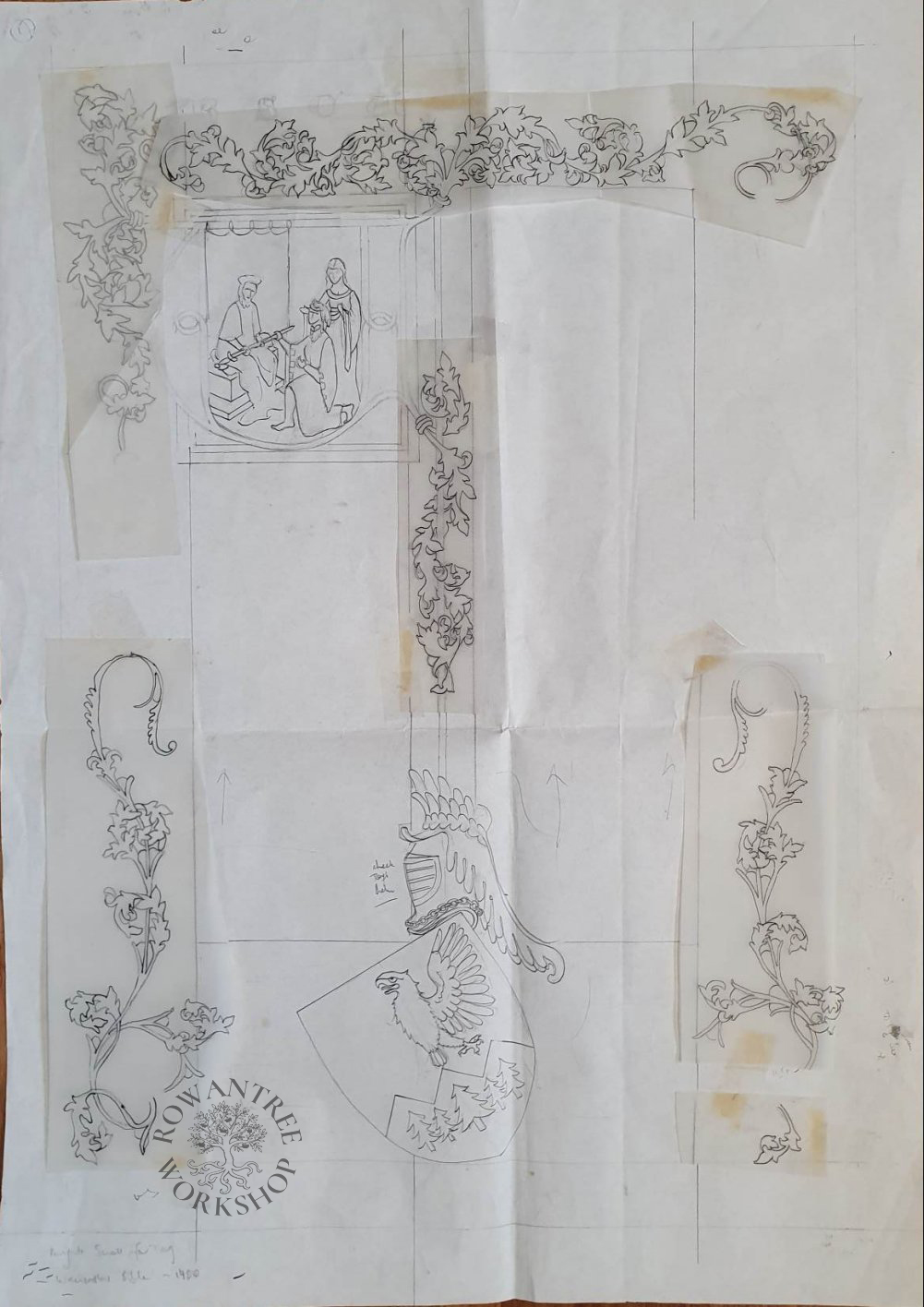
I decided to make this piece the same scale as the original. I marked up the 2 column layout and traced the border elements from the blue page, adjusting to fit on the layout page (you can see the stickytape). I used the initial U, but replaced the scene inside with an image of Torg being knighted, in his signature houppelande.
I replaced the illumination at the base with the device, adapting the crested helm from the coloured page, but using his own helm). And I adapted the chapter heading to say ‘KSCA’ – the abbreviated title of the award.
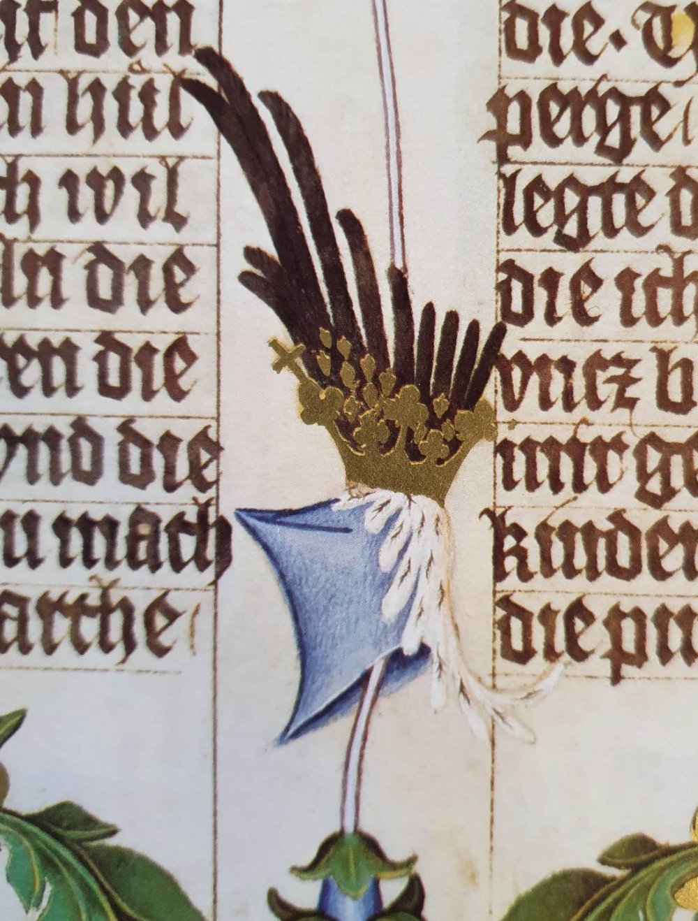


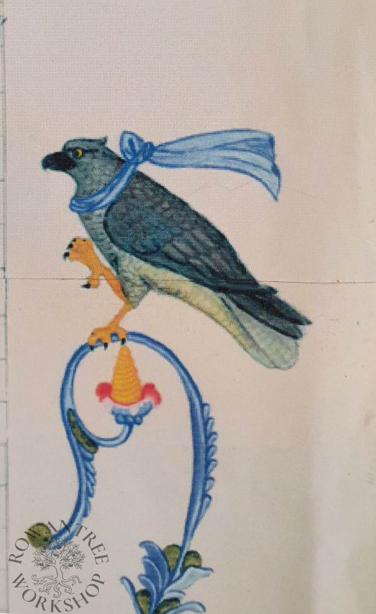
The manuscript is full of images relating to King Wenceslas – the ‘Wenceslas knot’, the kingfisher (his favourite animal), and the gothic letter W. I have turned the kingfisher into a hawk, to reference Torg’s name and heraldic device. I also added a blue knot to the wreath above the mantling.

Once the illumination design was complete, I did several test runs on the calligraphy, to make sure it would fit in the space.
Construction
I needed a large page – much larger than any parchment I had, so I used a sheet of quality rag paper.
I copied the bare outlines of my design in pencil using my light-box, then ruled up for the calligraphy. I lettered the piece in Gothic Textura Quadrata style, using a metal dip pen and Windsor & Newton ink.
The next day, I traced the the detailed illumination design and used a fine Rotring pen to outline everything. Once it was dry, I rubbed out all the pencil.
As always, the goldwork comes first. I used my gesso made according to Cennini (Thompson 1960) and laid this on the gold areas. Once dry, I used a knife to scrape it smooth, then wet it with glair. Once tacky, I laid the 22 carat gold leaf and let it dry. I used a soft brush to remove the excess gold, cleaned up the edges carefully with a knife and burnished it lightly.
Although I copied the design of the foliage from the blue page, I wanted a more colourful effect, so I used the colouring from the other pages – a mix of blue, green and pink.
I painted the coloured letters in the text in Windsor & Newton gouache, and laid in the main colour areas. Then I worked on one section at a time, shading the foliage and other elements, then adding highlights. Finally, I then went over all the outlines again with a fine pen.
Afterword
At the time I made this piece, I did not have a camera. A friend made a scanned copy for me, in two halves. The images here are photos of that scan, so the colour balance and resolution are very poor. These days I make sure I take quality photos before giving the pieces away.