

This piece is based on a 15th century Italian manuscript from the Morgan Library.
I wanted to create a personalised document (scroll) for my friend Diccon, to celebrate his achievements in the field of rapier combat – and his love of gardening.
Research and Design
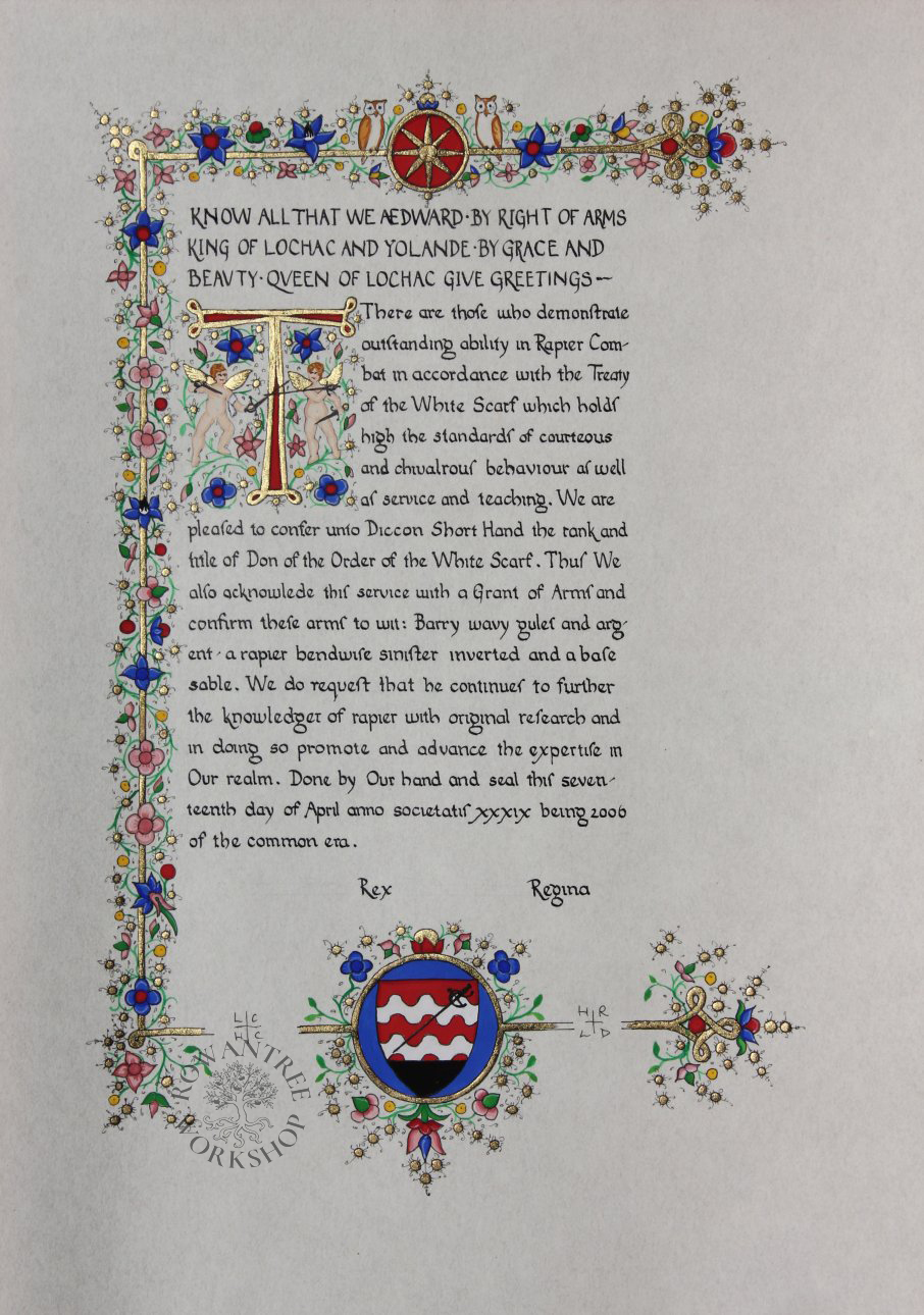
The inspiration for this piece was the Literary Manuscript, written in Florence in 1470-75 and now held by the Morgan Library (MS M.497). This manuscript has several very similar pages, with a single justified column of text, an inset capital, and a floral border around three sides with heraldic device at the base.
The original layout has an introductory paragraph all in capitals in brown ink, with the main text in an Italian Humanist hand in black, with very wide spacing between the lines. I took the same approach, but penned all the text in black ink.

Source: Morgan Library

I copied the border design, with its line of gold surrounded by flowers – and the very wide margins. At the base, I kept the central heraldic device, and appropriated the two side rondels for the seals.
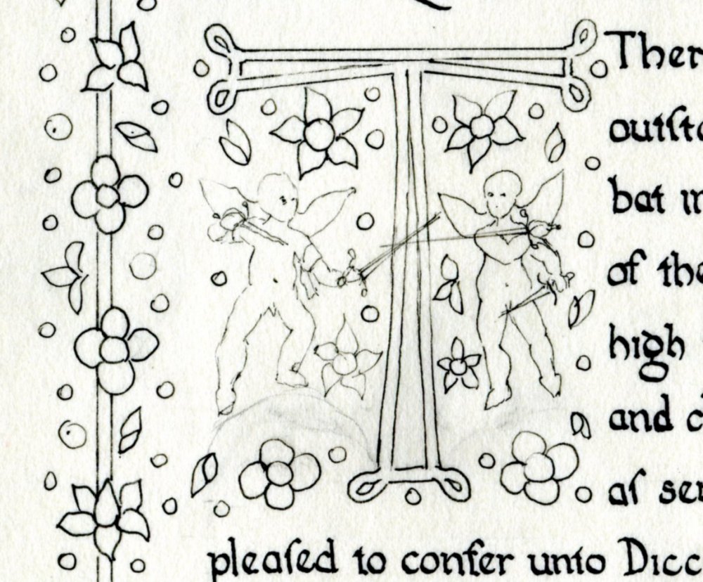
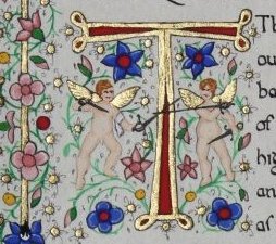
I changed I loved the winged putti, but there was no room for them on the base. Instead, I added putti to the capital, which I changed from an L to a T, in the same style. I gave them swords to fight with – one left handed, to match Diccon.

Source: Wikipedia
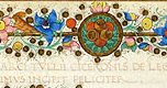
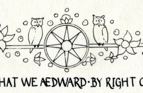
In the top border, I replaced the green rondel with a star based on the step diagram from a renaissance fencing manual. In place of the original birds, I put a pair of owls, as a reference to the name of the award – Order of the White scarf of Lochac (OWL).

Construction
I started by scaling up a copy of the original manuscript to the right size, then drew out the main elements on my design page, making sure there was room for the seals and signatures.
I did a rough lettering trial to to check it would fit the page nicely – first version was way too large. The second was closer, but still too long – the third version fit. I pencilled the key outlines on the parchmentine, pencilled my guide lines and lettered the text, then left it to dry overnight.
With this safely done, I used a lightbox to trace the detailed elements of the capital and border, then inked them all in with a fine pen. Once dry, I rubbed out all the pencil, ready for the illumination.
Goldwork first. I used an easy size for the gold – PVC glue mixed 1:1 with water, with a little red gouache for colour. Laid generously, let dry, breathe to reactivate, lay 22 carat gold transfer leaf and press well. Once all the gold was laid, I let it dry overnight.
I use a soft brush to remove loose gold, then my penknife to clean up the edges. So many dots! I laid in the large areas of colour, using Windsor & Newton gouache. Then I worked the shading, one colour at a time, and then the highlights. I drew in the green vines by eye, to link the other elements and fill the space.
Finally, I outlined the gold and main elements with a fine black pen, adding all the little hairs and twiddles on the gold dots. The putti on the original have very delicate outlines, so I did not ink these again – there is enough definition without.

Diccon was very pleased with the result – and noticed the left-handed putti immediately!